Saturday, August 23, 2014

Graphics In Your Life ( 5 Annoying Graphic Applications ) We Would Love To Never See Again


5 Blah (Still) Graphic Images In The Environment and Online


My favorite logo redo to dislike. I remember the day they launched the new JC Penny logo and my marketing professor and I made a bet. I felt the logo and company was going in a unsuccessful direction, while she liked the new logo. My thoughts were then and now that the logo is in a SQUARE BOX, meaning  square, uncool. This logo and GRAPHICS do not take into consideration the psychological effects of shoppers who may view the negative white space as "Void" lacking in substance and that the "Square" may communicate into what products they carry. I like the red color and the blue isn't horrible, but for a clothing store I would not use a square with white space.


I think the Mellow Mushroom GRAPHICS and logo are too distracting. This sign near my home in Hickory, NC is hard to read and there is a disconnect between the graphics and their store-fronts. The sign and graphics almost seem to be selling tie-die tee-shirts while the building in the background looks like a Systel copy wholesaler. I think they are trying to sell GROOVY fun, but once inside there isn't much going on. I just don't care for the layout and colors used.


Not sure what was going on here, but every time I see this sign I cringe. The GRAPHICS and design are hard to read and none represent the really high-end gourmet food that is sold inside. The typeface looks like that of a machine and welding shop, far from fresh-bakes pastries and crepes. The colors do not work well and don't really communicate a dining atmosphere. They need some awnings and a graphic logo with food, wine and pastries illustrated.


Disconnect is the first thing that comes to mind here. This GRAPHIC, physical and online banner is placed outside of the Hickory Salt Block Museum and is advertising a furniture event that will be held there, The graphics, logo and colors don't work well together. They should have made the logo smaller and in the bottom right corner, allowing for more space to graphically work with some furniture images. Then change the colors.


The use of the credit card GRAPHICS and the hand-made sign are slightly overkill and clutter the message they are trying to quickly communicate " we take these cards." No need to put signs all over such a nice wooden door. This graphic application was seen outside of a country store near Morganton, NC. The hand-drawn graphics missed entirely and only added clutter. They could have used a rustic, aged graphic application and shown the cards only once.


15 Graphics in Your Life ( WEEK 1 - instructional graphics assignment, Dana Mathews )

6 Interesting (Still) Graphic Images In The Environment


This background GRAPHIC { justice for all } in the above black and white photo was taken at a Starbucks in SoHo New York a few years back on Christmas day 2011. I asked my wife to pose across from an older gentleman to communicate an untold message "aging in contrast to youth is often unjust and has little justice at times." Many are treated as if they no longer are contributors to society. The GRAPHIC here is nicely done in bold letters and a sort of urban typeface, font styles contribute greatly to telling stories and messages ( without speaking a word ). I love its simple form and spacing.


This colorful GRAPHIC image was on an older Communication Art's magazine. I love the way they use color, white space and shape in each of the graphic applications. The graphics mixed in range makes the magazine cover interesting and captures a readers attention with little effort. Great job at communicating what is inside of the magazine.


This GRAPHIC image hangs on a wall in my home. I talked my wife into posing for the photo and later I reworked it in photoshop. It is oversized at over 45 inches. I designed the piece after a trip to New York where I was stimulated by all of the art and visual images in the city. The graphic fonts are modern and thin, spaced far apart to represent the modern fashion industry. Off of the "N" I used an ear ring to represent trends in the industry. The colors used were polarizing to garnish attention and highlight the text. The signage was used to showcase "Rockstar Fashion Global" I like the modern look of the GRAPHICS used.


I love the GRAPHIC design used on this storefront in New York City. It was simple; yet, the clean use of type and colors communicate easily what the store is and brings about a level of trust from those entering the store. Graphics should always tell a story without having to guess what they are trying to say. Simple is always best and shows well here.


The simplicity and campaign of most of David Sedaris' work is often laced with bold and simple graphics, many of which are comedic in nature. As in his writings these GRAPHIC illustrations give you a sense of who he is, what he writes and that he is actively involved at telling stories. The richness of the simple images, mixed with sharp comedy makes for a great campaign when he tours. I love the use of basic colors and simple illustrations and photographs he uses. The above were from a poster in downtown Asheville, a theatre poster and a CD cover from one of his audio books.


This is a great example of selling a brand with few words and images. The iconic GRAPHIC logo speaks for itself and the Chanel company. The stark black and white add value and quality to the display in New York City. The logo is very simplistic; yet, powerful in its bold characters used.

6 Interesting (Still) Graphic Images From Online


I love the over all GRAPHICS use in this online landing page for Banana Republic. The use of black and white, the thin type face and conservative use of the wavy lines at the bottom add richness to the brand and site. The over all feel is very inviting to shoppers. CLEAN.


This online GRAPHIC image was used to invite someone to enter a process of registration, to take action and to convert an online shopper to an actual purchaser of the products. The simple use of the red wording "it" is compelling and grabs the viewers attention. The graphics are all clean and the silhouettes add to the look of the design without clutter. I love it's simplicity.


This GRAPHIC has a French feel to it. The use of spacing the bold letters and limited use of type opens the space up and allows the viewer to process what the site is asking them to do "shop, enter here." THis is a great example os less is more and adds to the theme of the brand.


I love the way they used the letters at the top, the colors and italics to add interest. The GRAPHIC works well with the page and the images below. It connects the page and the lower use of multiple images draws the shopper in. The use of the green graphics works well behind the clothing. THis entire page has a campaign feel, but not to heavy on the sale message.


Simplicity wins again! The GRAPHICS used here are perfect! Not too crowded and interesting enough to get your attention. This online invite would easily get someone's attention. The colors used compliment the graphics used and the olive and green work well together.  The white borders do a great job at separating the two messages. Clean and simple.


Instructional GRAPHICS and retaining students/users interests is done really well on this online site - lynda.com. The use of colorful images, easy steps and great instructional videos make for a great experience. The graphics used highlight versatile learning categories and group the subjects very well. The navigation and use of bold GRAPHICS are helpful in the process of learning.

Below is a video explaining color use:  
http://www.lynda.com/Design-Color-tutorials/Foundations-Color/120601-2.html


Monday, March 31, 2014

5 Steps To Avoid Cyberbullying and Videos to Educate Our Teens About Bullying


Social networking web sites such as Facebook and Twitter are useful Internet tools for friends to keep in touch and can be utilized to meet new people with similar interests. 

These sites have become very popular among teens as they seek to explore/define who they are and connect with others like themselves. If used responsibly, these sites can be a positive and beneficial resource for youth. Too often, however, adolescents include too much personal information, discuss inappropriate behaviors that could get them into trouble, or otherwise place themselves at risk by what they share on their online profiles. We have heard a number of stories of youth who have been cyberbullied using information found on social networking web sites. Follow these guidelines to use social networking web sites safely and responsibly:

Cyber bullying can mean more than just harassing someone or saying mean things it also can involve posting images or comments about someone you barely know or even using their images in ways which can effect their future or embarrass them. 

5 Steps To Avoid it

 • Always Assume that EVERYONE has access to your profile (parents, teachers, future employers, and law enforcement) even if you have your profile restricted to “friends only.” Don’t discuss things you wouldn’t want them to know about. Don’t use language you wouldn’t use in front of your parents. Finally, make sure you set your profile to “private” so that you can control who has easy access to your information.
• USE DISCRETION when putting pictures (or any content for that matter) on your profile. Your friends might think that picture of you acting silly at the party last night is hilarious, but how will your parents or a potential employer react? Also remember that when your friend (or a stranger) takes your picture it may end up on their profile for all to see.
• Assume people WILL use the information on your profile to cause you harm. Don’t put anything online you wouldn’t want your worst enemy to know. Also, don’t add people as “friends” unless you know them in real life. Even if you think you know them, be skeptical. Kids often think it is cool to accumulate and have thousands of “friends.” Just remember that these people have open access to all of your posted content and information.
• Assume there are predators out there trying to FIND YOU based on the information you provide on your profile. Think like a predator. What information on your profile identifies who you are, where you hang out, and where you live? Never post this kind of information anywhere online. Your friends know how to find you.
• You may be held responsible for inappropriate content on your profile that is in violation of the Terms of Service or Acceptable Use Policies of the Internet Service Provider or web site(s) you use. Moreover, school districts across the country are revising their policies to allow them to discipline students for online behavior that can be linked to a disruption in the classroom environment – even if you wrote or posted the content at home from your own computer.

The above information has been gathered and supplied for use on our blog by the research and concerns of

Sameer Hinduja, Ph.D. and Justin W. Patchin, Ph.D. Cyberbullying Research Center
( no authorship is implied, copyrights are that of the said above and below authors.)


The Effects of Cyberbullying


Thursday, February 27, 2014

How To Use Blogging to Enhance A Lesson (and why)


Blogging can take a lecture-style lesson and turn it into a knowledge collaboration. Working together to collect and share information allows students to be active participants in their own education.

Blogs can allow for integration of several media sources. Links and graphics can add interest to the learning experience. Blogs are also great for peer to peer learning. See our video above for a complete over view of how blogging can serve as a great learning activity.

Wednesday, February 19, 2014

Designing A Blog As A Learning Activity In The World of Web 2.0


Today social media blogs have grown in numbers as educators address the new needs of students and the availability of web 2.0 tools. A well written blog can both communicate events and news, as well as as serve as a great educational tool. The use of blogs has shown to improve writing skills  in students, while also providing the platform to learn about media literacy and the correct usage of the internet.

This learning exercise has been designed to educate on the uses of a blog as well as how the tools function in a blog environment. This exercise will take the viewer through each step of setting up a blog, how it functions and how each individual element serves a purpose in the process.


In the end you can publish your blog and enjoy its educational benefits to students

Things to remember in designing a blog:


• What do you want your blog to communicate?
• What types of helpful links will you include?
• Are all components helpful and neccessary ?
• Have you chosen a good design (colors and fonts)?
• Do you have interesting images to make the blog appealing?
• Have you credited all copy and images


"Our groups web 2.0 blog was originally designed not only to be a helpful learning exercise, showing the viewer how to design a blog site, it was also carefully planned and designed to show you how to select and use images, links, badges and copy, to make the blog look exciting and a place where a student or educator can find valuable and usable information. The links, RSS feeds, videos and content has been build around web 2.0 learning tools. Each piece of information is usable and can be linked to other projects. Our groups intent was to provide a realistic looking blog that can be used as a source of information on the changing world of web 2.0 and its many tools."

"Imagine just our current projects alone. If you build a blog you can post class assignments and graphic charts which may help others in the class. The KWHL chart is a great example of usable graphics to include on a classroom or informational blog, everything highlighted with updates and current posts."


Before starting

The learning exercise will run smoothly if you view the two YOUTUBE videos first and then follow the simply step by step directions below


Step 1. 

Set up a google email account. create one nowIf you have one already you can skip this step and go directly to the blogger home page. See below for step 2.


Step 2.

Create a blog

To start a blog with Blogger, visit the Blogger homepage, enter your username and password, and click Sign in. Enter a display name and accept Blogger's Terms of Service. Then click the Create a Blog link and get started!
Pick an address (URL) and a blog title. Then, choose your favorite blog template (this is how your blog will look when you publish it). Now get creative, add information to your personal profile, and customize how your blog looks, if you feel up to it. Start blogging now!
Dashboard

Your Dashboard, as always, is your starting point. This is where all your blogs are listed, and you can click on the icons next to them to perform various actions on each blog, such as:
  • Writing a new post: Just click on the orange Pencil icon on your Dashboard to access the Post Editor.
  • Viewing your posts: The gray Post List icon will take you to a list of your published and drafted posts for a specific blog.
  • Catching up on your favorite blogs: Below the list of your own blogs, you’ll see a list of the blogs you follow with an excerpt from their latest posts.
  • Everything else: Check out the drop-down menu next to the Post List icon for a quick link to:
    • Overview
    • Posts
    • Pages
    • Comments
    • Stats
    • Earnings
    • Layout
    • Template
    • Settings
Note that the Earnings tab will only show if AdSense supports your language.

Overview

Overview
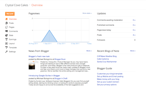
On the Overview tab, you can see your blog’s activity, news and tips from the Blogger team, and recent Blogs of Note.
Write your post
Once you've signed in to Blogger, you'll see your dashboard with your list of blogs. Here's what you need to do:
  1. Click the orange pencil icon to write a new post, and enter anything you want to share with the world.
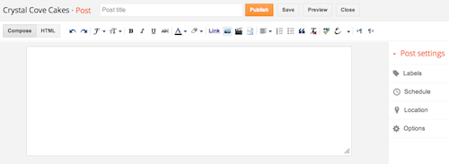
  2. Next, you'll see the Post Editor page. Start by giving your post a title (optional), then enter the post itself:
    New post
  3. When you're done, click the Preview button at the top to make sure it's ready to go, and then click the Publishbutton to publish your post.
Add an image
You can add an image from your computer or the Web to your blog. Click the image icon in the Post Editor toolbar. A window appears prompting you to browse for an image file on your computer, or enter the URL of an image on the Web.
Once you've selected your image, you can then choose a layout to determine how your image will appear in your post:
  • The 'Left', 'Center', and 'Right' options allow you to customize the way your blog text will flow around your image.
  • The 'Image size' options will determine how large the image will appear within your post.
Click UPLOAD IMAGES to add your image, and then click DONE when the notification window appears telling you that 'Your image has been added.' Blogger will then return you to the post editor, where you'll see your image ready to be published to your blog.
You can also publish images to your blog using your mobile device, Google's free photo software Picasa, or a third-party service like flickr.
Add a video
To add a video to your blog post, click the film strip icon in the Post Editor toolbar above where you compose your blog text. A window appears prompting you to 'Add a video to your blog post.'
Click Browse to select the video file from your computer that you'd like to upload. Note that Blogger accepts AVI, MPEG, QuickTime, Real and Windows Media files and that your video must be less than 100MB in size.
Before uploading your video, add a title in the 'Video Title' box and agree to the Terms and Conditions (you'll only have to do this the first time that you upload a video with Blogger). Then click UPLOAD VIDEO.
While your video uploads, you'll see a placeholder in the post editor showing where your video will appear. You'll also see a status message below the post editor letting you know that your upload is in progress. Depending on the size of your video, this usually takes about five minutes. When it is complete, your video will appear in the post editor.
Customize
Your template is a fun way to customize your blog. When creating a new blog, you're first asked to choose a default template, this is the basic design of your blog. You can choose from many templates for your blog; simply pick the one that best fits your needs.
Template"
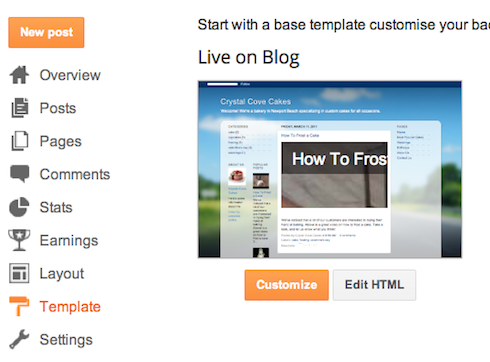
Once on the Template tab, you can either click on the orange Customize button to get started with our easy-to-use WYSIWYG (“What you see is what you get”) template designer, or choose one of our many default templates. If you’d like to edit the HTML of your blog, just click the gray Edit HTML button.
In addition, you can customize your blog's design using our intuitive drag-and-drop interface. You can also add powerful gadgets such as slideshows, user polls, or even AdSense ads. If you want more precise control over your blog's layout, you can also use the Edit HTML feature. To edit your blog's layout, follow these steps:

  1. Click Layout from the drop-down menu on your dashboard below the blog you would like to customize.
  2. From there, click Edit to edit existing gadgets, or Add a Gadget to add new ones.
  3. To add a new gadget after you've clicked Add a Gadget, simply click the plus sign next to your desired gadget. You can choose from gadgets by category, or search for a specific gadget in the top right of the pop-up window.
  4. Make sure the gadgets chosen serves a purpose and not used to fill space.
  5. add_gadget
  6. Once you've added the necessary information to your selected gadget, click the orange Save arrangement button. Your layout changes will appear instantly.

Privacy and permissions

By default, your blog is completely public, and can be read by anyone on the internet. However, if you want to keep it private, you can do that, too. You can change these settings on the Settings | Basic tab.
Permissions and Privacy
  1. Under the 'Blog Readers' section, you'll probably see 'Anybody' selected as the default. When you change this to 'Only these readers,' you'll get an Add Readers button.
  2. Click the Add Readers button and then enter the email address of a person to whom you'd like to grant access to your blog. To add multiple people, separate their addresses with commas.
  3. For each address entered, the Google Account associated with that address will be given access to view your blog. If an address is not associated with an account, that person will receive an invitation email with a link allowing them do one of three things:
    • Sign in to an existing account.
    • Create a new account.
    • View your blog as a guest (no account required).
Copy and directional steps are copyrighted by Google and used for educational purposes only, no ownership is implied.